How to Run a UX Audit: The 2026 Website Playbook
A website UX audit finds where your site leaks visitors. Our studio's 2026 process: the full checklist, pricing in PKR and USD, and which fixes to make first.

How to Run a UX Audit: The 2026 Website Playbook
Your website has a traffic problem, or a conversion problem, and you cannot tell which one. Analytics says visitors arrive and leave. The homepage looks fine. The team insists the checkout "works". Meanwhile the money quietly leaks out through cracks nobody is inspecting.
That is what a website UX audit is for. Not a redesign. Not a workshop full of sticky notes. A disciplined inspection — done by someone who has seen a hundred sites — that finds exactly where experience breaks, ranks each breakage by the money it costs you, and tells you what to fix first.
We run these audits at AISquadX for clients in the US and Pakistan, and the pattern never changes: the fixes that matter most are almost never the ones the client expected. This is the process we use, written up so you can run it yourself.
When a UX audit is the right move
Do not audit for the sake of it. A UX audit pays off in specific situations:
- Conversions are flat or falling and nobody can explain why.
- Bounce rates are climbing on key pages — especially landing pages fed by paid traffic.
- You are about to spend on ads or a relaunch. Paying to push traffic into a broken funnel is the fastest way to burn a budget. Audit first.
- Support tickets keep asking the same questions. That is not a documentation problem. It is a design problem wearing a documentation costume.
- The product grew without a designer watching. Every deploy added a pop-up here, a banner there, a new plan tier squeezed into the pricing table. Compounded over a year, the experience is now an attic.
- Six months have passed since the last one. Websites drift. Content accretes. Competitors move. Twice a year is our minimum recommendation.
If none of these apply, you probably do not need an audit — you need patience and a bigger sample size.
What a proper audit actually covers
A lot of articles reduce the UX audit to "check the navigation and the buttons". That is a Tuesday afternoon, not an audit. Our audits examine five layers, because problems rarely live on the layer where they show up:
- Business logic — does the page sell what the visitor came for? Is the offer clear within five seconds? We have seen beautiful pages that failed here: the value proposition was poetic and incomprehensible.
- Information architecture — can people find things? Navigation labels, search behaviour, page hierarchy, dead ends.
- Interaction design — forms, buttons, filters, checkout flows. This is where friction hides: the dropdown with 40 options, the date picker that needs a manual.
- Visual and interface design — hierarchy, contrast, consistency with the brand and the design system, mobile behaviour.
- Technical and performance — Core Web Vitals, broken links, error states, accessibility, SEO-blockers that leak traffic before UX even gets a say.
Skip any one of these and you will miss the real cause. A checkout with a 70% drop-off is rarely fixed by a prettier checkout page. It is usually fixed by something upstream — a shipping-cost surprise, a trust signal missing on the product page, a form asking for a phone number nobody wants to give.
Step 1: Define the question before you open a single page
This is where most DIY audits go wrong. They open the site and start listing niggles: "the footer has too many links", "this shade of blue feels off". Two hours later they have a hundred observations and zero insight.
Before touching anything, write down:
- The goal. One sentence. "We want 30% more quote requests from the services page" beats "improve UX".
- The users. Who is arriving, from where, with what intent? Pull this from GA4, not from opinions.
- The scope. Which pages and flows? A five-page brochure site is one thing; a 200-screen SaaS product needs scoping to the money flows: signup, activation, upgrade.
- The baseline numbers. Conversion rate, bounce rate, exit pages, mobile vs desktop splits. Screenshot everything. In three months, when someone asks "did the audit work?", these numbers are your answer.
An audit without a defined question becomes a checklist exercise. Checklists find lint; questions find leaks.
Step 2: Read the data before you look at the design
Designers want to start with the design. Resist. Start with analytics, because data tells you where to look and judgement tells you what you are seeing.
Pull, at minimum:
- Top entry and exit pages. Where people arrive, where they give up.
- Funnel reports for your money flow. If you do not have funnel events configured in GA4, that itself is the first finding — you cannot improve what you cannot measure.
- Device and browser breakdowns. If 68% of your traffic is mobile but the audit starts on a 27-inch monitor, the audit is a fiction. Our audits start on a mid-range Android phone, because that is what most of the world — and most Pakistani users — actually browse on.
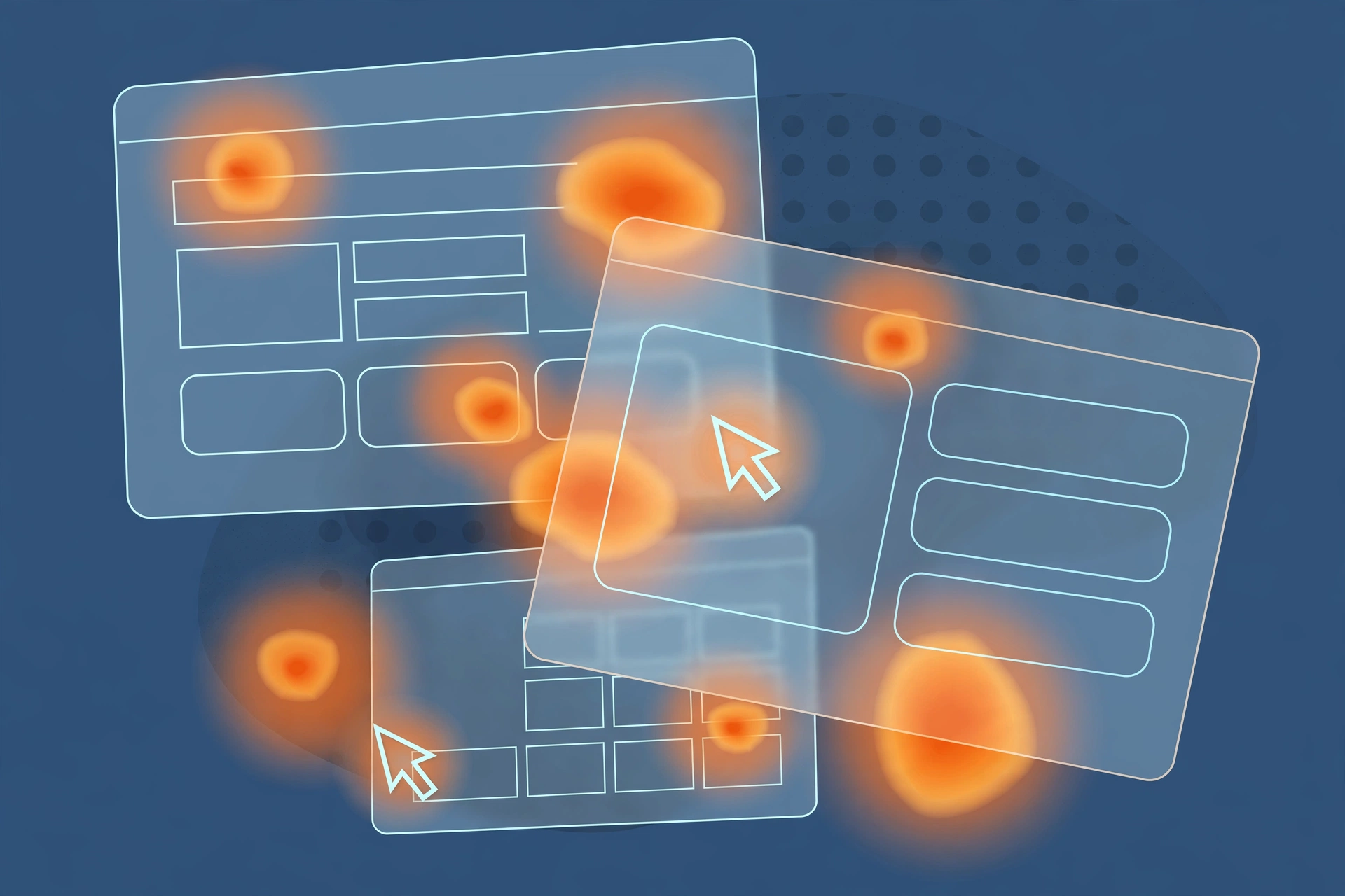
- Heatmaps and session recordings. Microsoft Clarity is free and catches things analytics never will: rage clicks on a non-clickable element, users scrolling past the actual CTA, forms abandoned at field six. Watch 30–50 recordings of your key flow. Patterns show up fast.
- Site search queries (if you have search). Users typing what your navigation hides is a gift — it is the audit writing itself.
- Support tickets and chat logs. Five hours of reading tickets teaches you more about your UX than five usability tests.
Frame every number with a question. "Bounce rate is 74% on the pricing page" is a fact. "Are visitors shocked by the price, confused by the tiers, or failing to find the plan that fits?" is the start of an audit.
Step 3: Run the heuristic review, screen by screen
This is the part people picture when they hear "UX audit": an expert walking the product against established usability principles. Jakob Nielsen's ten heuristics are still the backbone after 30 years — visibility of system status, match with the real world, user control, consistency, error prevention, recognition over recall, flexibility, minimalist design, help with errors, and documentation.
We do not mechanically tick boxes. We walk each key flow as a user would — first-time, confused, on a bad connection, in a hurry — and log every point where the product asks more of the user than it should.
The checkpoints we never skip
The five-second test. Show someone the homepage (or landing page) for five seconds, then hide it. Can they say what you sell, to whom, and what to do next? If not, everything downstream is decoration. Most B2B sites we audit fail this. They open with a slogan, a stock-photo skyline and a "Learn more" button. Nobody learns anything.
Navigation honesty. Read every label and ask: would a stranger know what is behind it? "Solutions", "Resources", "Platform" are all hiding something. Count the items — more than seven in a primary nav and people stop reading, they start scanning. Check for dead ends: pages with no path forward except the back button.
Forms. Every field costs conversions. Audit every form on the site and interrogate each field: is it strictly necessary? Does the label sit above the field (not inside it as a disappearing placeholder — a classic)? Is the error handling helpful or hostile? "Invalid input" is hostile. "Enter your phone number with the country code, e.g. +92 300 1234567" is helpful. Mobile form UX tested on a real device, not just DevTools, is non-negotiable — fat fingers are a real constraint.
Calls to action. One primary action per screen. Button copy should name the outcome, not the mechanism: "Get my free audit" converts better than "Submit". And the CTA must survive scrolling — if the only buy button is 3,000 pixels below the fold on mobile, you do not have a CTA, you have a rumour.
Trust signals where money changes hands. Testimonials, logos, guarantees, pricing transparency. The single most common finding on Pakistani agency and ecommerce sites we audit: the price is hidden behind a contact form. In the US market that reads as evasive. Put the price on the page, or say honestly why you cannot.
Content and copy. Read it aloud. If it sounds like a brochure, it reads like a brochure. Specifics beat adjectives every time — "response within one business day" beats "lightning-fast support".
Mobile behaviour. Not "responsive", actually usable: tap targets at least 44px, no horizontal scrolling, sticky elements that do not cover the content they are supposed to help with, the hamburger menu that actually gets opened (check your analytics — many do not).
Error states and empty states. Break things deliberately. Enter a wrong password, submit an empty form, visit a deleted URL, go offline mid-checkout. The quality of a product is revealed in how it handles failure, and most sites we audit have never seen their own 404 page.
Accessibility. Run Axe or Stark, check contrast ratios, keyboard navigation, focus states, alt text. This is not charity — it is market size. And in the US, it is increasingly a legal exposure.
Performance. Core Web Vitals are UX: an LCP over 2.5 seconds means a quarter of your visitors experience a slow site before they form an opinion of you. Check on a throttled 4G connection, not office wifi. For the full treatment, see our Core Web Vitals guide.
Step 4: Stress-test against the 2026 reality
A UX audit done the 2020 way misses things that matter now. Three additions we made to our process this year:
Design-system drift. If your company uses Figma and AI-assisted coding, check whether the shipped product still matches the approved designs. Applitools' September 2026 release lets a Figma frame act as the visual baseline that catches drift from AI-generated code automatically — the pattern is worth adopting whatever tool you use. Drift is death by a thousand pixels: each one trivial, the total effect "this feels off" and nobody knows why.
AI-surface readiness. The interfaces of 2026 are being read by two audiences: humans and AI agents. ChatGPT, Perplexity and Google's AI mode increasingly summarise and act on your pages. If your pricing is in an image, your key facts only exist inside a video, or your content requires JavaScript gymnastics to render, machines cannot read you — and a growing share of your discovery happens through them. Our SEO for AI search playbook covers this in depth.
Motion and material honesty. Apple's iOS 26 Liquid Glass made adaptive transparency the visual language of 2026, and web design is following. During an audit, check that decorative glassmorphism, blur and animation are not costing you legibility, contrast or performance. Every effect must survive the question: does this help the user, or does it help the designer's portfolio?
Step 5: Turn findings into a backlog, not a report
Here is the uncomfortable truth: most UX audit reports are read once and filed. The findings are correct and nothing changes. The failure is in the format.
We do not deliver "issues". We deliver a backlog, and every item has:
- A screenshot or recording — the exact place, no ambiguity.
- Severity: blocker, major, or minor. A blocker stops the user completing the goal. A major frustrates them. A minor is polish. Be ruthless — if everything is a blocker, nothing is.
- Evidence. "3 of 5 users hesitated here" or "42% drop-off at this step in GA4". Findings without evidence are opinions, and opinions get argued with.
- The fix, sized. Concrete enough that a developer can start Monday. "Improve the form" is not a fix. "Reduce to 4 fields, move labels above inputs, add inline validation on blur" is a fix.
- Estimated effort: hours, not sprints. Small, medium, large. Clients act on small wins first; the audit should hand them a first week of work, not a six-month roadmap.
Then sort the whole list by impact-to-effort ratio. The top of the list should be things that take a day and move a number. Momentum beats perfection — a team that ships three fixes in week one will ship the rest. A team handed a 90-item document will schedule a meeting about it.

What almost every audit finds
Run enough of these and the same culprits keep walking into the room. If you want a head start before your own audit, check these first — in our experience, at least three of them are live on your site right now.
The invisible primary action. The main CTA exists, technically. It is below two hero sections, a logo marquee and a testimonial carousel. On mobile it requires commitment-level scrolling to reach. We measure "time to first CTA" in audits now: if a visitor cannot see an action within the first viewport, the page is a brochure, not a funnel.
The form that interrogates. Name, email, phone, company, budget, "how did you hear about us", message. Seven fields to ask a question. Every field you add costs you a slice of completions — the well-known rule is that shorter forms convert better, and in our observed ranges, cutting a contact form from seven fields to four typically lifts submissions by 20–40%. Ask for the minimum. Get the rest on the call.
The pricing page that answers nothing. Three tiers with feature checkmarks, no prices ("contact us"), and no guidance on who each tier is for. Visitors do not contact you to resolve confusion; they leave. If you genuinely cannot publish prices, say why and give a range. Silence reads as "expensive".
The mobile menu nobody opens. Analytics from client after client: desktop-style hamburger menus on mobile get opened by a fraction of visitors, and the pages behind them starve. If your key journeys depend on the hamburger, test bottom-tab navigation or move the top two destinations into the visible header.
The trust gap at the money moment. A checkout or quote form with no reviews, no guarantee, no human face, no response-time promise. Trust is not a homepage decoration; it belongs at the exact point of hesitation. One client added a single line — "Replies within one business day, no spam ever" — next to their quote form and saw submissions rise within a month. Small, specific, honest.
The auto-playing everything. Carousels that rotate before anyone reads the first slide, videos with sound, pop-ups at eight seconds. Each one is a small tax on attention, and attention is the currency. If it moves without the user asking, it needs a very good reason.
The 404 that gives up. A generic "page not found" with no search box, no popular links, no humour, no path forward. Broken links happen; wasting the visitor who hits one is a choice. Your 404 should convert the lost, not confirm they are lost.
None of these require a redesign. All of them are found in an afternoon by someone who knows where to look. That is the whole argument for the audit.
Step 6: Price the work honestly
Since we publish real numbers elsewhere on this blog (see our UI/UX design cost breakdown), here is the audit-specific version for 2026.
Two honest notes. First, the US–Pakistan gap is mostly overhead: no Manhattan lease, lower salaries, remote-first teams. The methodology is the same; the spreadsheet does not care where the analyst sits. Second, a cheap audit that produces a vague report is the most expensive kind — you pay twice, once for the audit and once for the real one. Ask any auditor: what exactly do I get, how many issues typically, and can I see a redacted sample?
DIY cost, for completeness: your time. A thorough self-audit of a small site is 15–25 hours of focused work using this guide. The tools are mostly free.
Step 7: Run it, ship the fixes, measure again
An audit is not a deliverable. It is the first half of a loop:
- Audit — find and prioritise.
- Fix the top 10 items. Not all of them. Ten.
- Wait 2–4 weeks for a clean data window.
- Compare against your baseline numbers from Step 1.
- Repeat the audit on the next slice.
The teams that get 30–50% conversion lifts from audits are not the ones with the cleverest findings. They are the ones who actually shipped the fixes. We have watched a client sit on an audit for eight months, then blame the audit when nothing changed. The audit was fine. The shipping was not.
One more discipline: do not redesign while you fix. An audit that triggers a full redesign has failed — the point was targeted surgery, not a transplant. Redesigns reset your data, introduce new problems, and take six months. Fixes ship on Tuesday.
The DIY audit checklist (print this)
If you are running your own audit this week, here is the condensed version of everything above. Work through it page by page, flow by flow:
- Goal, users, scope and baseline numbers written down before you start
- GA4 funnels configured; entry/exit pages and device splits pulled
- 30+ session recordings watched on your key flow (try Microsoft Clarity)
- Support tickets and site-search queries reviewed for patterns
- Five-second test passed on every landing page
- Navigation labels rewritten in plain language; dead ends removed
- Every form field justified; error messages rewritten to be helpful
- One primary CTA per screen, outcome-focused copy, reachable on mobile
- Pricing visible or honestly explained; trust signals near money moments
- Copy read aloud; specifics replaced adjectives
- Mobile tested on a real mid-range device, not just DevTools
- Error states, empty states and 404s deliberately triggered and reviewed
- Axe/Stark accessibility pass; contrast and keyboard navigation checked
- Core Web Vitals green on throttled 4G
- Findings written as a sized backlog with severity and evidence — not a report
That list, worked honestly, will surface 80% of what a paid audit finds. The remaining 20% — the things you are too close to see, the benchmarks you do not have, the root causes behind the symptoms — is what you hire for.
Choosing an auditor: red flags and green flags
If this guide convinces you to hire the audit out rather than run it yourself, a few honest notes from the other side of the table.
Red flags. The auditor promises a specific conversion lift before seeing your site — nobody honest guarantees numbers. The proposal lists "UX audit" as a single line item with no methodology. The sample report (always ask for one, redacted) is screenshots with arrows and no evidence, no severity, no sizing. The timeline is "two days" for a 40-page site — that is a skim, not an audit. And the cheapest quote is usually the most expensive: a vague report you cannot act on costs you the fee plus the real audit you still need.
Green flags. They ask about your goals and your numbers before quoting. They tell you what is out of scope. The sample backlog has severity, evidence and sized fixes. They talk about what happens after — the fix loop, the re-measure — because they know the audit is half the job. They have opinions: an auditor who agrees with everything you say is a mirror, not an expert.
One question cuts through everything: "What will I be able to do on Monday that I cannot do today?" If the answer is concrete — "your developers will have ten sized fixes and the data to defend them" — you are talking to the right people.
Frequently asked questions
How long does a website UX audit take in 2026?
A focused expert audit of a 5–15 page website typically takes 5–10 working days: one to two days on analytics and data, two to three on heuristic review and testing, and the rest on prioritisation and the report. Full product audits with user interviews take three to six weeks.
How much does a UX audit cost?
In 2026, Pakistani studios typically charge PKR 100,000–400,000 ($350–$1,400) for a website UX audit, depending on page count and depth. US agencies run $5,000–$25,000 for the same work. The gap is overhead, not rigour.
Can I audit my own website's UX instead of hiring someone?
You can — and you should run one internally every quarter. But self-audits miss things. You have read your own copy a hundred times, so unclear wording looks fine to you. An outside eye, even from another team in your company, catches what familiarity hides.
What is the difference between a UX audit and a usability test?
A usability test watches real users attempt specific tasks; a UX audit is broader. It combines heuristic evaluation, analytics, technical checks, accessibility and competitor review into a single prioritised backlog. Usability testing is one method an audit uses, not the whole thing.
When should I run a UX audit?
When conversion is flat or falling, when bounce rates climb, after any major launch or redesign, before a paid-ads push, and on a schedule — twice a year minimum. Products drift. Every deploy adds small frictions that compound quietly.
What tools do I need for a UX audit?
PageSpeed Insights and Lighthouse for performance, Google Analytics 4 for drop-off data, a heatmap tool like Hotjar or Microsoft Clarity, an accessibility checker like Axe or Stark, and a spreadsheet to log issues. Everything else is judgement.
Should AI tools be part of a UX audit in 2026?
Yes, with limits. AI agents inside design tools like Figma can now run first-pass heuristic checks against your design system and flag implementation drift automatically. But they miss context — a pricing page that is technically fine and commercially wrong. Human judgement still makes the call.
The audit is the easy part
Anyone can find problems on a website. The skill — the part worth paying for — is knowing which ten problems are costing you money, and in what order to kill them.
If your site is leaking and you would rather have us find the leaks, that is literally what we do. Our audits run on the process above, on real data, and the backlog we hand you is sized so your developers can start Monday. Talk to us — and if you want to see how we think about design work more broadly, start with our services or the studio.
Share this article
Keep reading
All articles
Figma AI Agent in 2026: The Designer's Field Guide
Figma's AI agent writes plugins, edits your canvas and talks to code via MCP. What it costs, where it breaks, and how our studio actually uses it well.

Dark Mode Website Design in 2026: The Owner's Playbook
Dark mode website design in 2026 is a retention decision, not a toggle. Our studio playbook covers palettes, CSS, accessibility and real PKR/USD pricing.

Design Tokens in 2026: Why Your Style Guide Just Became an API
Design tokens in 2026 decide whether your brand survives the AI era. This studio guide covers token naming, the DTCG format, Figma variables and real costs.
Next
Tell us what you're building.
A plan, a timeline and a fixed price within a day. Nothing starts until you agree to it.